Choosing a color for your rug is harder than choosing a color for your walls — the rug is in your sightline and determines the atmosphere of your entire room. In this guide: how to determine the right color based on your interior style, light, and existing furniture.
The 3-color rule
A good interior has one main color (60%), one secondary (30%), and one accent (10%). Your rug can fill any of these three roles:
- Main color (neutral/large) → beige, gray, light brown, or cream. Safe and timeless.
- Secondary color → soft pink, dark blue, mustard, green — the rug makes a statement without screaming.
- Accent → bright red, orange, turquoise, purple — a statement piece in a small space or as a visual anchor.
By interior style
Modern minimalist
Sleek furniture, little color in the room? Choose a subtle color with rich patterns. Gray vintage, beige, or a muted blue works best. The pattern adds character without the color 'popping'.
Scandi / Japandi
Light colors, wood, natural materials. Soft powder colors or cream — like light vintage rugs. Not too busy a pattern. A simple kilim can also be beautiful.
Bohemian / eclectic
Here, color is allowed. Combine boldly: pink, orange, red, or a busy multi-colored kilim is fine.
Industrial / loft
Concrete, steel, dark wood. A warm contrast works best: red vintage, terracotta, or warmer orange brings humanity to an otherwise stark space.
Classic / rural
Dark furniture, warm tones. Deep red, dark green, or brown vintage carpets with classic patterns fit perfectly.
Per room
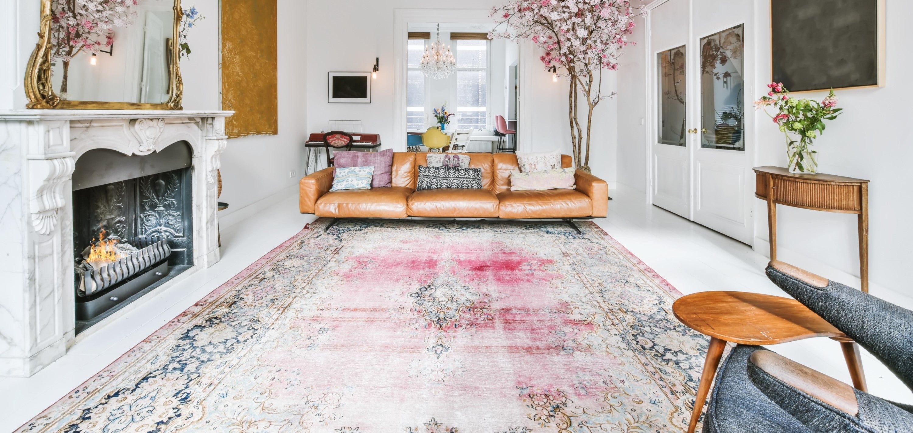
- Living room → your most important investment. Better one statement rug than a safe boring one. The rug you'll still love ten years later.
- Dining room → a bit more practical; choose colors that don't immediately betray stains. Pattern-rich vintage or kilim in mid-tones.
- Bedroom → calm tones for a good night's sleep. Soft pink, blue, beige.
- Children's room → cheerful but not garish. Lighter shades of pink, blue, or yellow.
- Hallway/corridor → darker is practical (hides dirt). Burgundy, dark blue, dark brown.
Light: north vs south
A room facing north has cold light. Warm colors (terracotta, orange, yellow) soften that. A room facing south has a lot of warm light — there you can use cooler colors (blue, green, gray) without it feeling chilly.
The 5 biggest color mistakes
- Choosing too 'safe'. Beige on beige on beige = soulless.
- Exact match to the sofa. A tonal variation (same color family, different intensity) is more beautiful.
- Bright accents in a small space. In a 12 m² bedroom, fuchsia becomes too dominant. Tones are subtle.
- Light color in a high-traffic area. Hallway with cream rug = dirt visible within 2 weeks.
- Not considering a pattern. Sometimes a pattern-rich rug creates more character than a new color choice.
Concretely: how do you do it?
- Determine your main furniture color (often sofa or dining table)
- Choose a rug color that either complements (same family, slightly different) or contrasts (complementary). Avoid "identical".
- Browse our vintage collection using the color filter
- When in doubt: send us a photo of your room and you'll receive personal advice.
Still hesitating between 2 colors? At Lavinta, returns are easy — 14 days to decide if the color is right for your room.